Travel Nurse Housing Responsive Website
Project: Travelpad (travel nurse furnished housing)
Role: Solo designer
Duration: January 2022- May 2022
Tools Used: Adobe XD, Canva, Google Slides, Microsoft Office Suite, YouTube, and pen/paper
Travelpad
Travelpad and its responsive website were created as a project while completing the Google UX Design Professional Certificate.
Project Vision
The Travelpad desktop and mobile websites seek to simplify the process of finding furnished, short term rentals for travel nurses. By providing tailored search options and filters such as search by hospital, Travelpad caters to the need of nurses traveling to new contracts all around the country every 4-13 weeks.
Challenge
Creating a website for travel nurses that is:
Getting Started
We began our rental house website journey by performing foundational research. Topics explored include how travel nurses felt while house searching, what they looked for in a property, what features they were most willing to compromise, and what they wished they did before they signed the lease. Findings were then used to create interview questions. Five potential Travelpad users were interviewed, leading to an understanding of pain points and unique circumstances travel nurses face as they are house hunting.
Empathizing With Users
Foundational Research
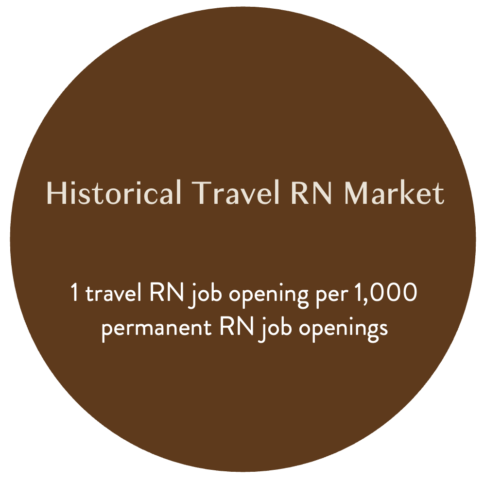
It is important to begin by stating that nurses, also known as registered nurses, are often referred to as RNs. Travel nursing is not a new niche in nursing. It has been around for a long time as a temporary means to fill nursing positions due to absences (e.g. maternity leave), seasonal patient surges, new unit openings, and implementing of new hospital protocols. According to Aya Healthcare, a travel nurse agency, historically there has been 1 travel RN job opening per 1,000 permanent RN job openings.
Bureau of Labor Statistics (BLS) data showed that in 2019, only about 43,000 of the 2,982,280 registered nurses in the United States were employed as travel RNs. This translates to less than 2% of the total nursing workforce supplementing the needs of hospitals, which were experiencing an average RN vacancy rate of 8% at that time.
When the global COVID-19 pandemic hit the U.S. in 2020, travel nursing exploded.
During the first phase of this surge an M-shaped curve was observed due to the halt in elective surgeries and staff reshuffling at the beginning of the global pandemic.
Phase 2 showed how travel nursing spiked as outbreaks caused by new variants also increased the number of hospitalizations and travel nurses rushed to hotspots.
During phase 3 the number of travel nurse openings was no longer strictly tied to COVID-19 hospitalizations. By this point, nursing shortage that existed before the pandemic had become exasperated. Now the number of travel nurse openings is also fueled by staff shortages resulting from pandemic burnout.
The blue line shows the dramatic increase in open permanent RN jobs. This reflects the pandemic’s impact on nurses as many chose to retire early, quit, move into non-direct care roles, head back to school, or even leave the profession entirely to pursue non-nursing career paths.
Travel nursing is not a good fit for many people due to its nomadic and stressful nature:
Contracts can be anywhere from 4-13 weeks, with openings all throughout the country.
Some hospitals are found in busy, fast-paced cities like New York City. Others are in intimate, small-town areas like Merced, California.
Hospital trauma levels, resources available, patient management systems, protocols, and procedures are all different with each assignment.
Each assignment begins with a mad rush to complete compliance tasks such as state licensing, fingerprints, drug tests, online learning modules, onboarding paperwork, and other hospital-specific assignments prior to showing up on day one.
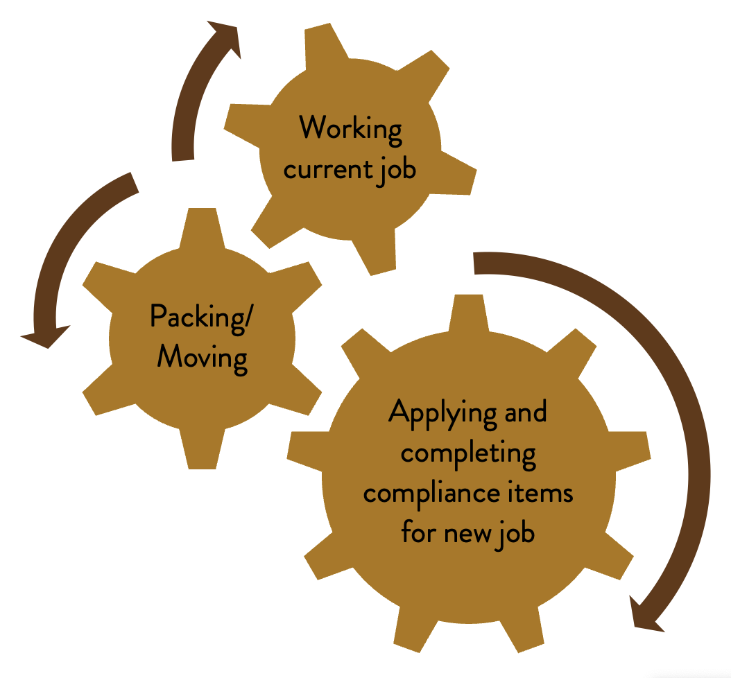
Contracts are usually not available more than three weeks before the nurse’s desired start date so it is often chaotic as they finish their last contract while applying for positions, packing, moving, finding new housing, and completing compliance items for the new job.
Competitive Analysis
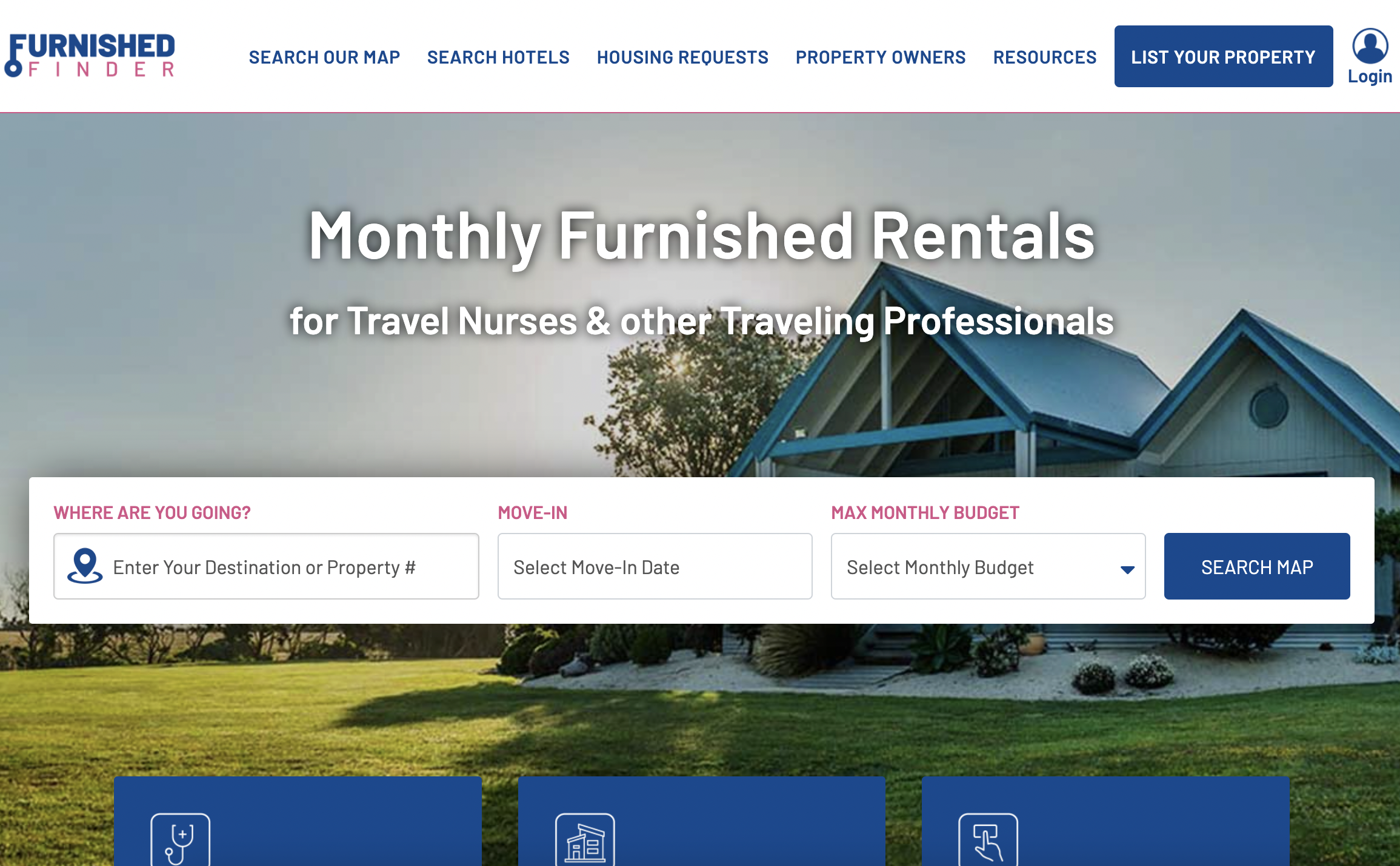
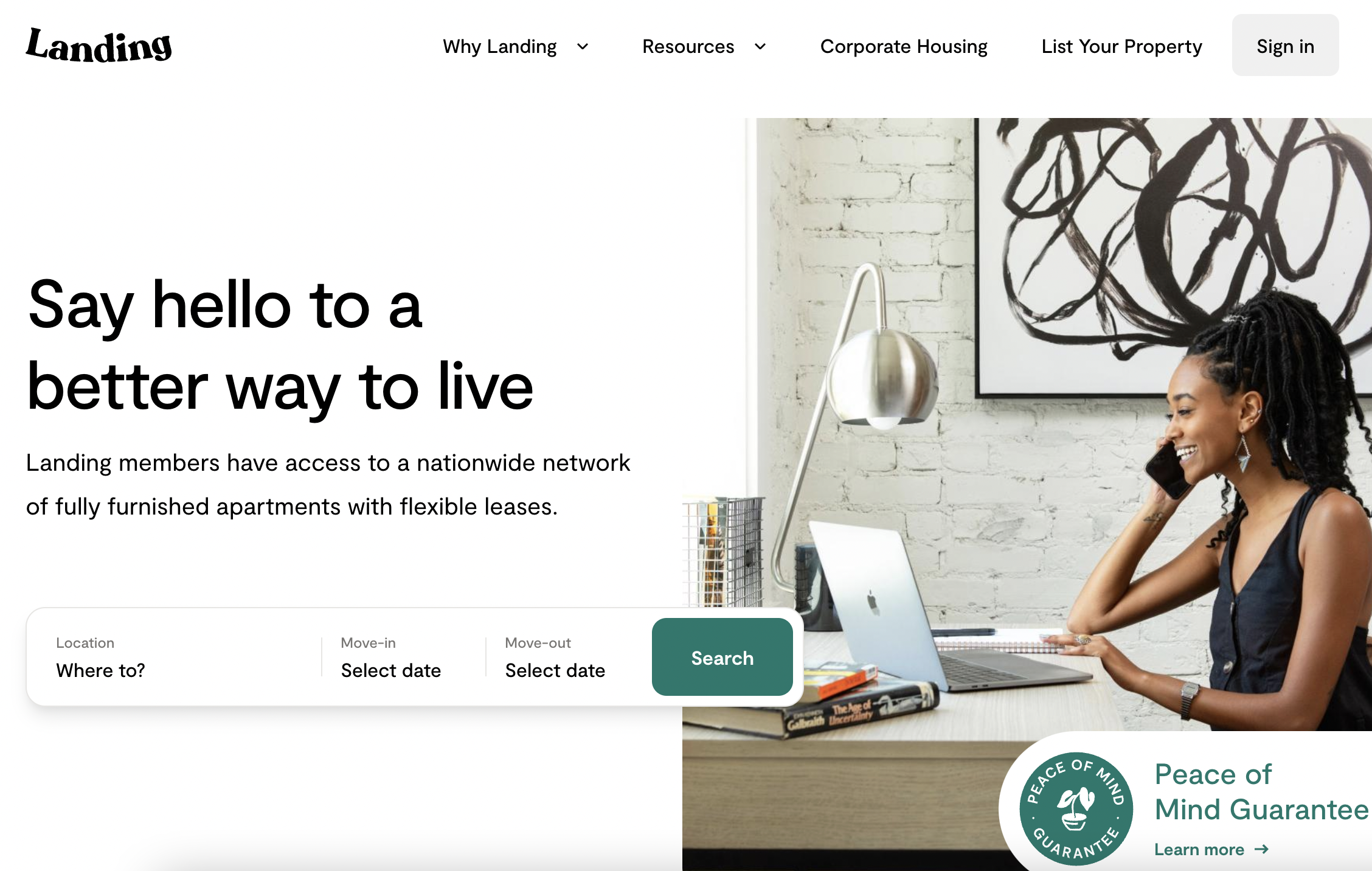
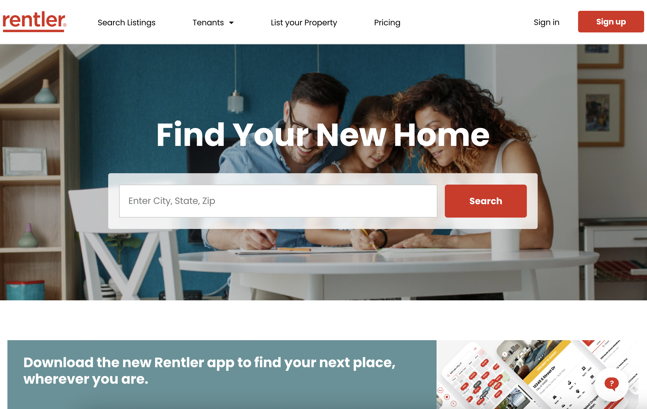
Three competitors were examined as part of this report. Furnished Finder connects landlords of furnished houses and apartments with travel nurses through out the country. Landing leases apartments from complexes, furnishes them, and subleases to traveling professionals in large cities. Rentler connects landlords of unfurnished houses and apartments with users who are looking for long term leases nationwide.
Furnished Finder
Users: travel nurses, traveling professionals
• Connects users with landlords renting furnished units
• All cities
• Variable lease lengths, short available
Landing
Users: traveling professionals
• Subleases apartments from apartment complexes and rents them furnished
• Larger cities
• Variable lease lengths, short available
Rentler
Users: long term tenants
•Connects users with landlords. Sometimes landlords use Rentler interface
•All cities
•Most often long term leases (e.g. year)
The following gaps were observed in competitors’ websites, which gives Travelpad the opportunity to shine:
Landlords are not required to provide their direct contact information on their listing for faster communication.
Listings do not always have actual pictures of the unit being rented or pictures of the whole house.
The monthly price does not always include utilities, leaving it unclear if travel nurses have to set that up too.
Travel nurses are in a time crunch finding housing. Providing a landlord’s phone number is more effective than an app message.
Pain Points
-
Booking without enough information about the property (e.g. property details, neighborhood information, pictures of property).
-
Not having a phone number and email for landlord. Waiting for message via the website or app slows down the process (quick responses are critical for travel nurses).
-
Not having filters for all important features. Travel nurses have unique needs when it comes to housing (e.g. flexible lease terms, night shift friendly sleeping conditions, storage).
-
Not being to easily compare housing and find similar housing that meets needs (e.g. price, amenities, location, pet policy).
Observations From Interviews
Travel nurses take assignments that range anywhere from 4 to 13 weeks, with 13 weeks being the most common.
Most nurses travel to new locations so they are unfamiliar with the area.
Many nurses work day while others work night, or even rotating shifts.
It is common for travel nurses to sign a new contract at the very end of their travel assignment so they have to quickly secure new housing while finishing the current contract, packing up, and traveling.
Some travel nurses are particular about their housing, but others do not want to spend them time combing through a lot of listings. They just need a place to stay.
What This Means For Our App
Streamline the tenant experience so all applications, payments, maintenance requests, etc. are taken care of on the website instead of directly with landlords.
Provide maps of the area with hospitals and other resources marked (e.g. neighborhood safety) so nurses can make informed housing decisions.
Include filters so that nurses can search for “night shift friendly” homes.
Require a completed landlord profile with a current email and phone number so they can be easily reached.
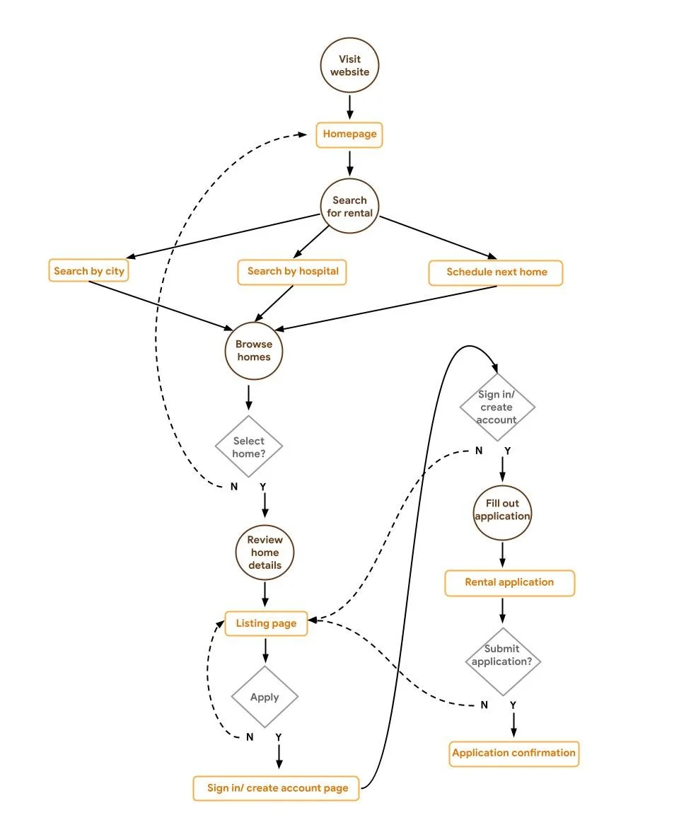
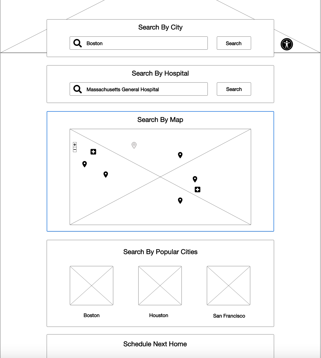
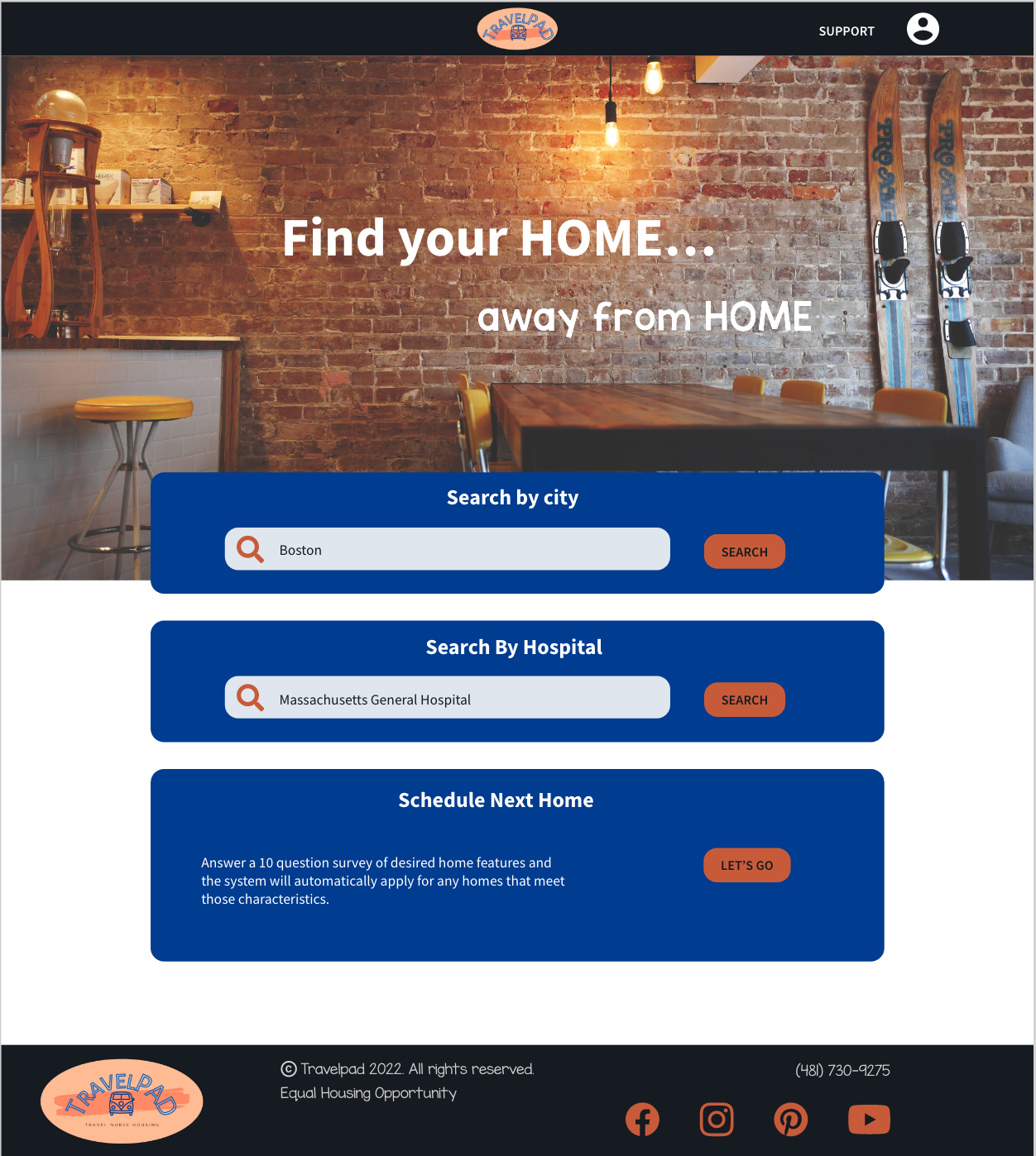
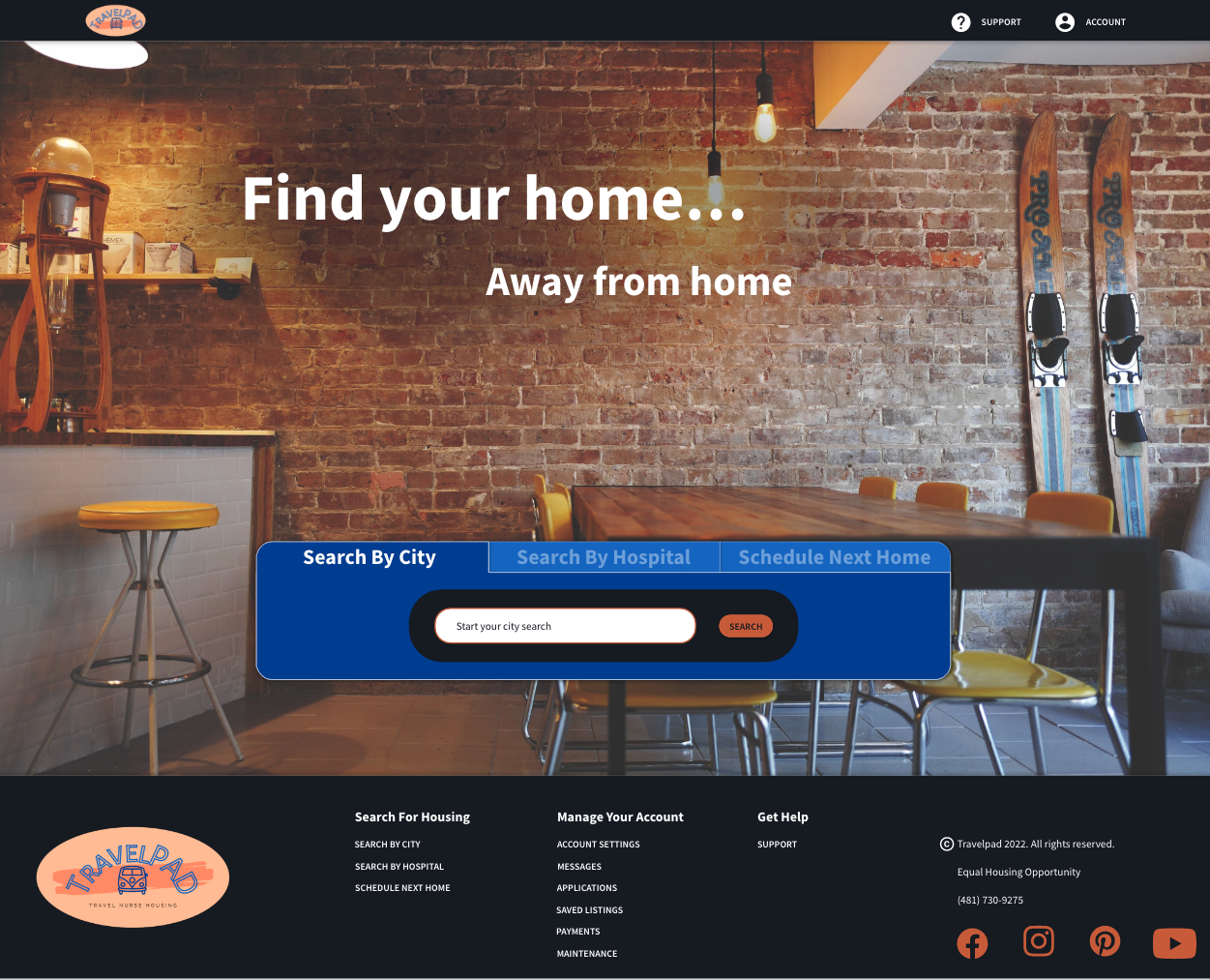
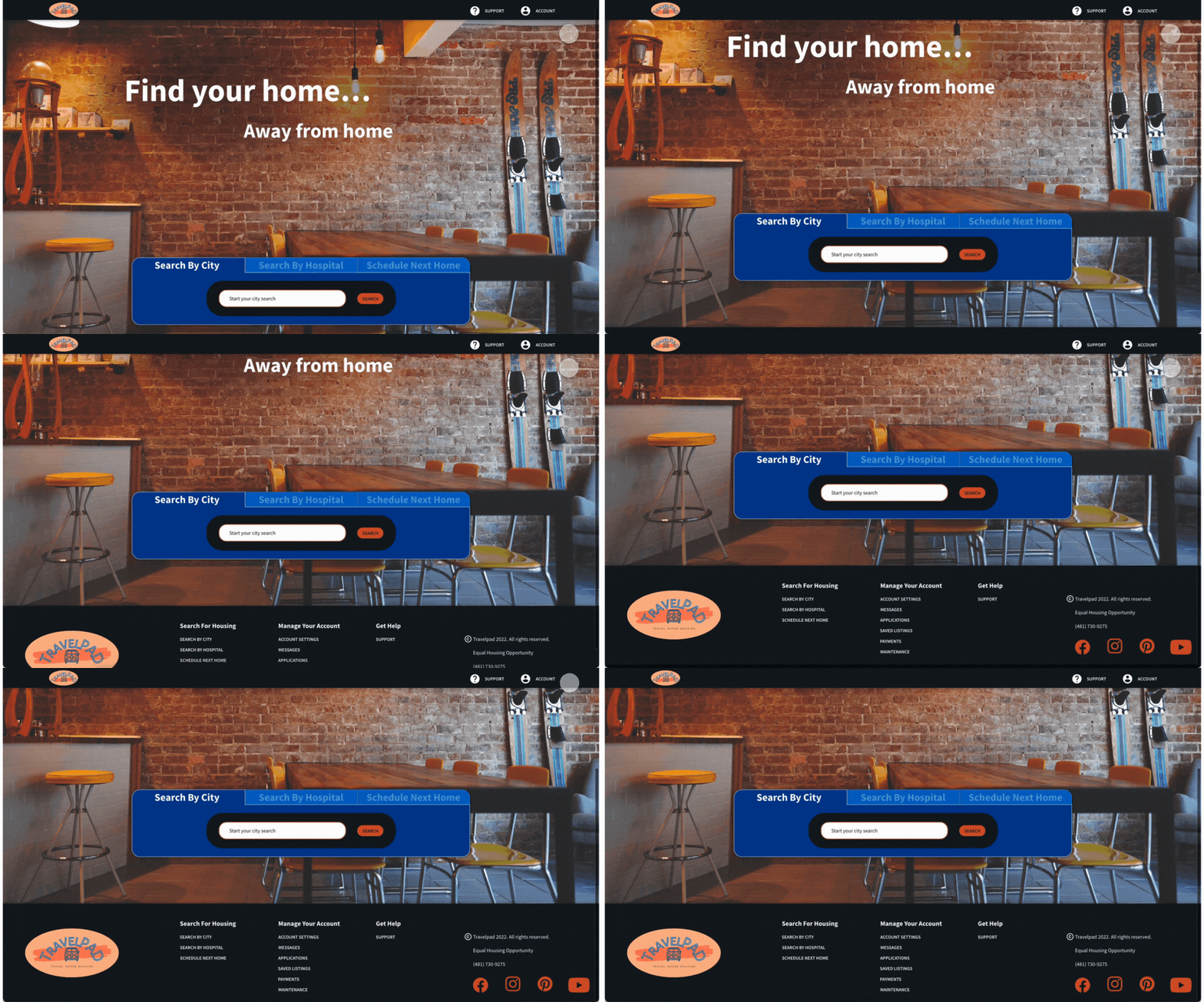
Give three ways to search for homes. Search by city and hospital for those wanting to look through all the listings. “Schedule Next Home” for those who are not particular and just need a place to stay.
“Finding housing is the most stressful thing I do as a travel nurse.”
Meet a User: Carson
Carson Wilson
Age: 26
Education: Bachelor’s Degree
Hometown: Cincinnati, Ohio
Family: Single w/ dog. Travels with friend.
Occupation: Nurse
My name is Carson and I am a 26 year old travel nurse. The pandemic created many jobs for nurses willing to travel. I currently travel around the country with my mid-sized dog for 13 week assignments. My friend is also a travel nurse and we travel together, but do not share housing. About 2-3 weeks before ending my current contract, I sign a new nursing contract in another city. Then it is the mad rush to find and book housing without every being in the area, all while working, packing, and moving.
User Journey Map
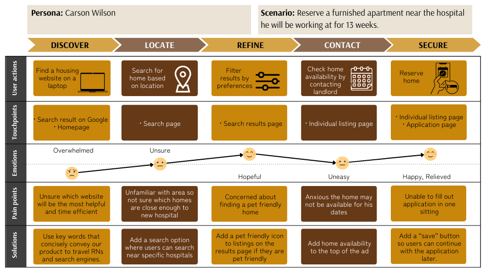
The Carson persona was used to create a user journey map. This further improved our understanding of user pain points and possible improvements.
Defining Goals
Goal From User Research
Have a user account section that includes settings, messages, applications, saved listings, payments, and maintenance.
Provide maps of the area with hospitals marked and distances from the home included.
Include filters that enable night shift nurses to search for homes that best meet their needs.
Have complete landlord profiles to expedite the leasing process.
Goals From The Competitive Analysis
Require landlords to provide a current phone number and email with their listing.
Standardize the use of accurate pictures that represent the whole unit.
Inform landlords that their monthly price must include all utilities.
Preparing the Journey
The next step of our journey was to ideate. This was initially done through user flows and paper wireframes. Later the paper wireframes were turned into digital wireframes and eventually into prototypes.
Planning For Users
User Flow and Information Architecture
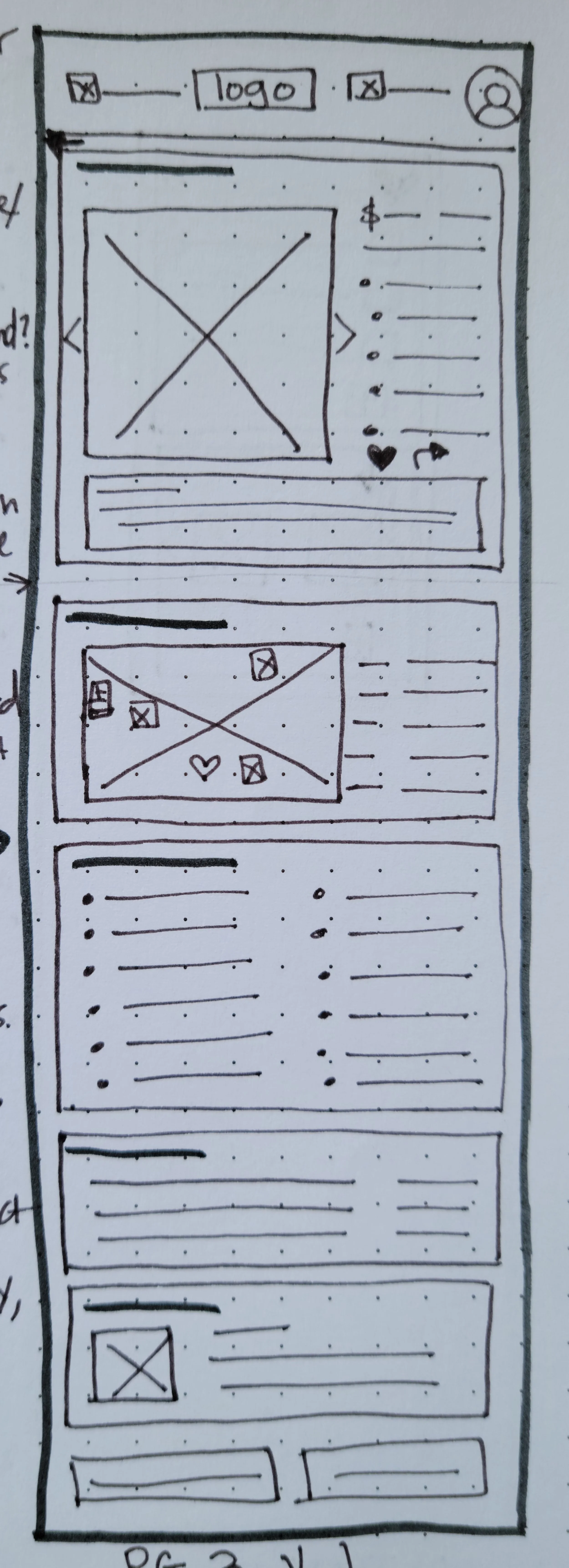
Paper Wireframes
Every page of the website began as a paper wireframe. This allowed for changes to be made quickly and cost-effectively as ideas were improved.
Several options were created for each page, with Version 1 being a compilation of elements from Options A-C.
Digital Wireframes
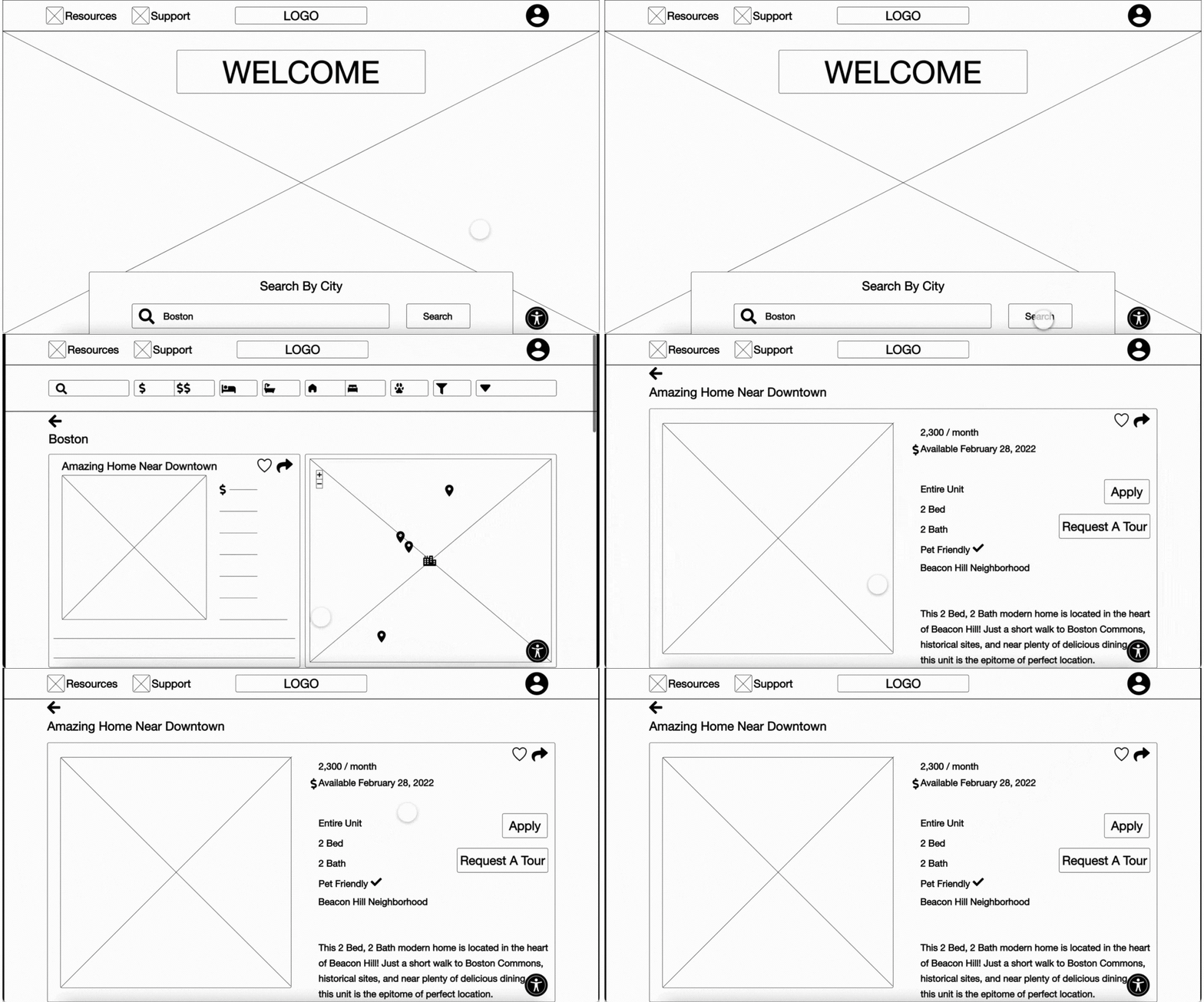
Paper wireframes were then converted into digital wireframes on Adobe XD.
Adapting For Users
Low Fidelity Prototype
Digital wireframes in Adobe XD were connected and animated to create a low fidelity prototype. The low fidelity prototype was then used to conduct a usability study.
First Usability Study
Five diverse users were part of the first usability study. The goal of the study was to figure out if the website provides the search functions and filters that travel nurses need to find a home. This was based on their top ten needs or wants. Key performance indicators were drop off and conversion rates. Major findings from the study include:
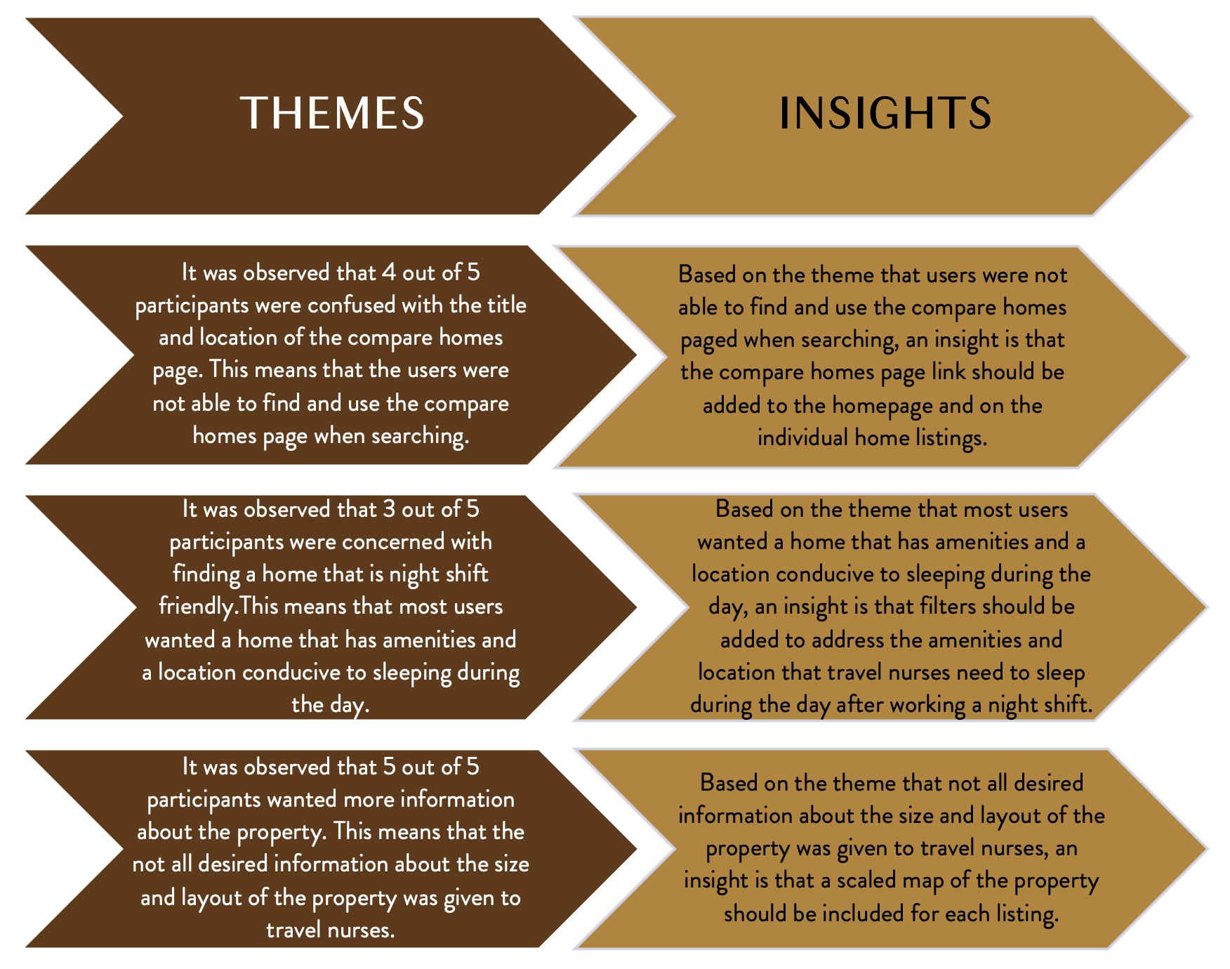
Users did not find the “popular cities” search function useful since the city they are looking at is dictated by their travel assignment.
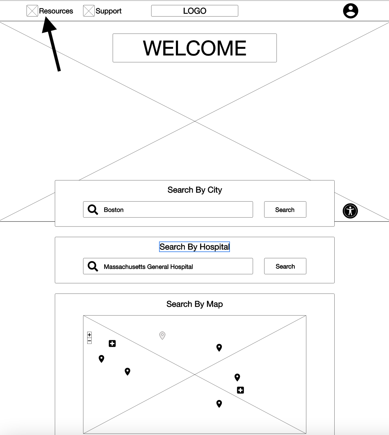
Users want the “compare homes” feature incorporated into the page with all the city or hospital listings instead of the top navigation bar and homepage.
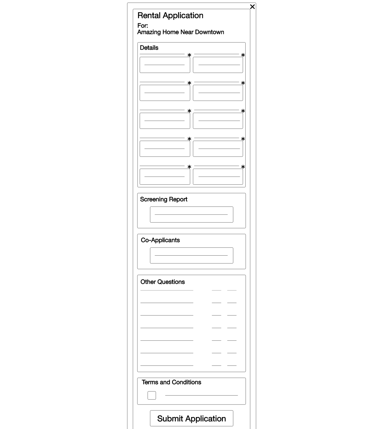
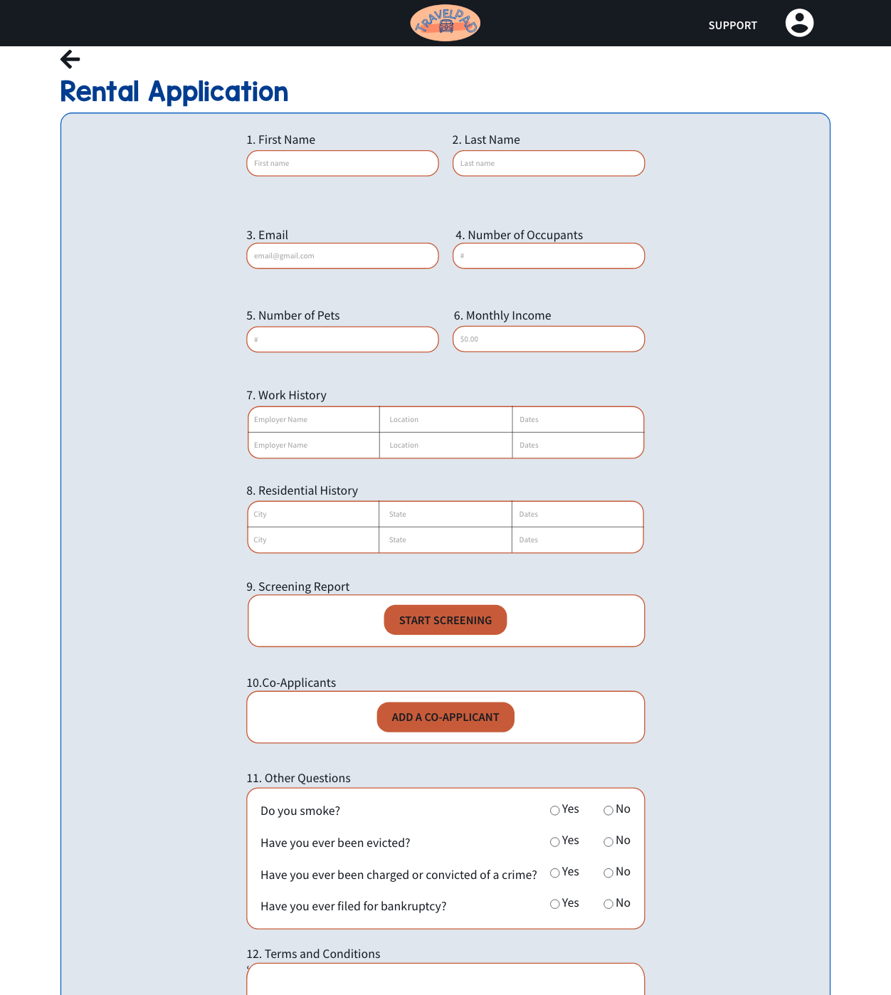
Users want the rental application to be a full page rather than an overlay.
High Fidelity Prototype
Key findings from the first usability study were taken into account when making the high fidelity prototype.
Insight #1: Users did not find the “popular cities” search function useful since the city they are looking at is dictated by their travel assignment.
➡
Insight #2: Users want the “compare homes” feature incorporated into the page with all the city/ hospital listings instead of the top navigation and homepage.
➡
Insight #3: Users want the rental application to be a full page rather than an overlay.
➡
The high fidelity prototype was then used to conduct a second usability study.
Second Usability Study
Five different users were part of the second usability study. The goal of the study was to figure out if travel nurses could complete the main user flow (apply for a home) after the redesign. Key performance indicator monitored was drop off rates. Major findings from the study include:
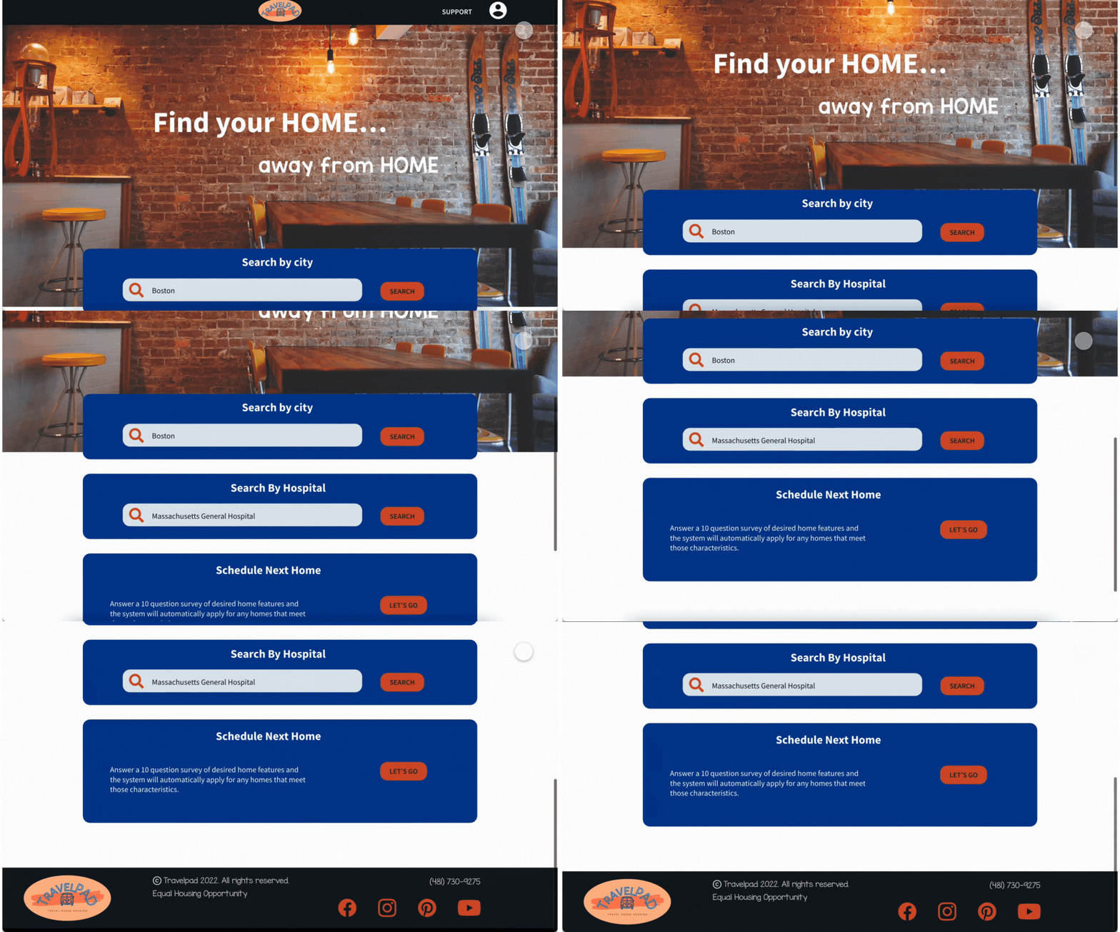
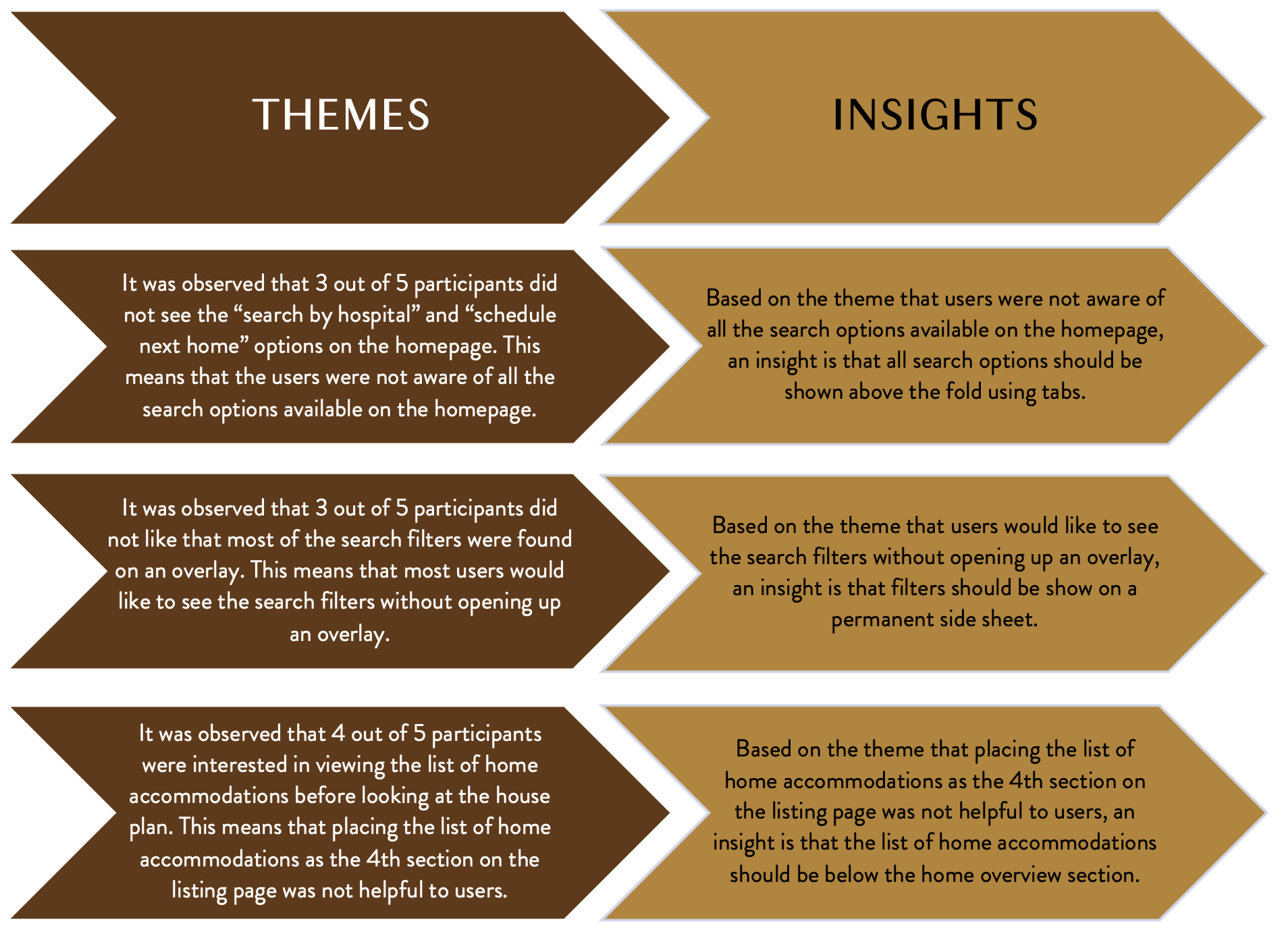
Users were not aware of all the search options available on the homepage.
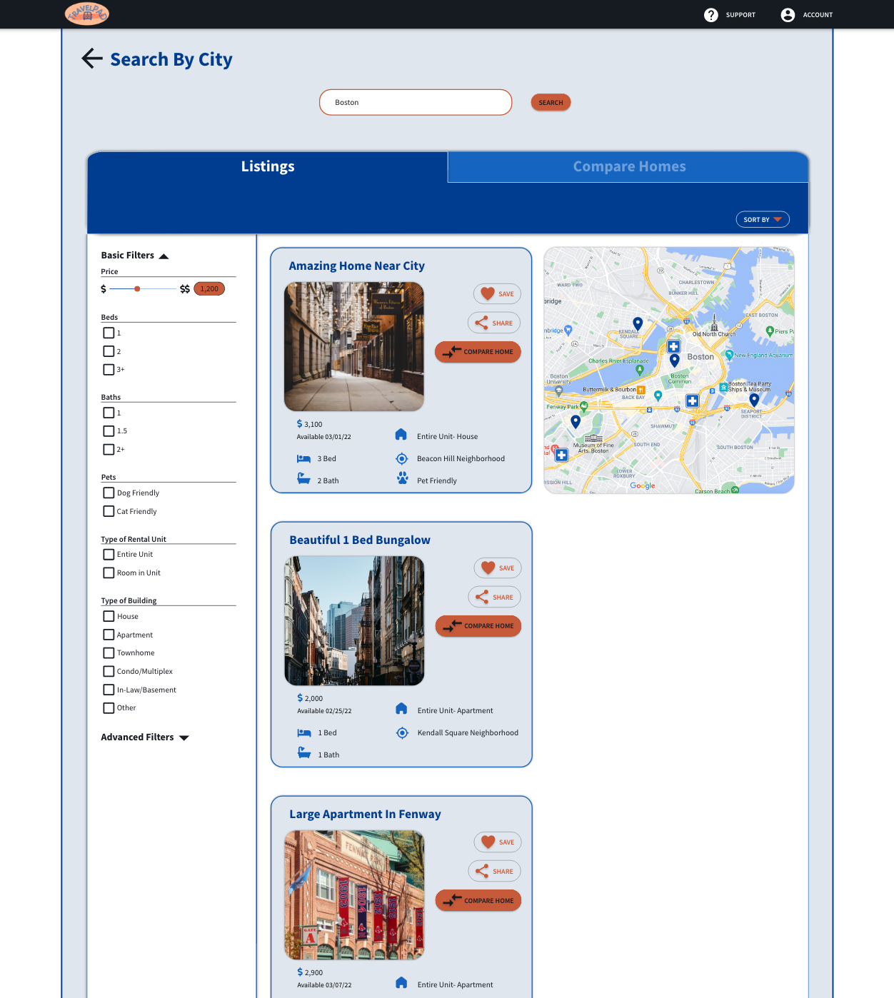
Users would like to see the search filters without opening up an overlay.
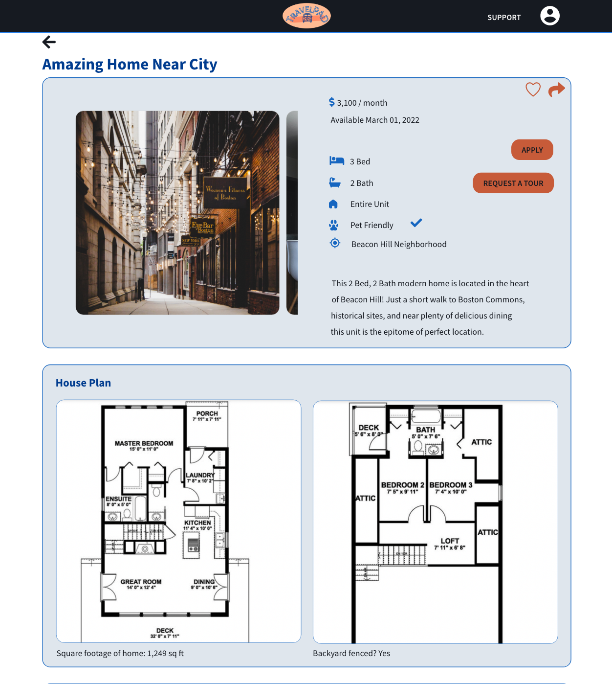
Placing the list of home accommodations as the 4th section on the listing page was not helpful to users.
Final Product
Key findings from the second usability study were taken into account when creating the final product.
Insight #1: Users were not aware of all the search options available on the homepage.
➡
Insight #2: Users would like to see the search filters without opening up an overlay.
➡
Insight #3: Placing the list of home accommodations as the 4th section on the listing page was not helpful to users.
➡
Unveiling The Final Product
This last section will outline the style guide used in the final version of Travelpad. It will also give a preview of the app before it heads to developers.
Preparing For Development
Style Guide
LOGO: Our product connects users with short-term, furnished housing through out the U.S. Using a car resembling a Volkswagen Kombi in the logo embodied the travel and adventure part of the travel nursing life. The name “Travelpad” focuses on the temporary nature (travel is a short, temporary experience) of these “pads” or housing units. One of the logos explained the product by including “travel nurse housing” below the car image.
➡
COLOR: Three neutrals were used as the primary colors: white, black, and light blue. Secondary colors included two darker blues, while two oranges were used as accent colors. Using white, black, and light blue gave the overall website a polished look while sticking with the blue theme. Blue was chosen because of its association with healthcare (users are RNs) and relaxation (what users hope to find in housing). Orange was used because of its connection to warmth and positivity, which is what users will experience when finding and staying at a Travelpad home.
➡
TYPOGRAPHY: Source Sans Pro in bold, semi bold, and regular was used for all the type. It was selected because of its legibility in all font sizes and its versatility with six different weights.
➡
TYPE SCALE: Source Sans Pro in bold, semi bold, and regular was used for all the type. A type scale was created for both the desktop and mobile versions. This creates consistency and appropriate sizing for fonts as users utilize the responsive website from devices of varying screen sizes.
➡
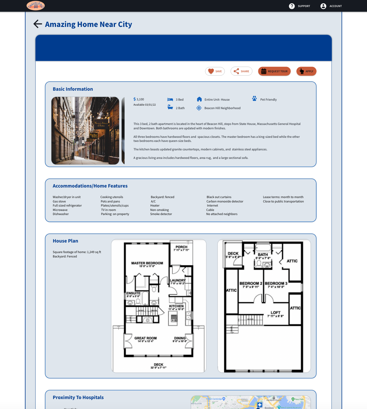
Seeing The Finished Product
Final Look
What I Learned
This project helped me grow immensely as a designer. While completing this website, I spent many hours researching in depth the most common components used in website design. Learning component names and their standard uses helped improve my designs and confidence as a designer.
Travelpad was also the first project I completed on Adobe XD. Just like previously with Figma, I spent a great deal of time reading articles, watching tutorials, and practicing what I learned. It was a game changer when I discovered the versatility of Adobe XD’s components and their different states. Suddenly I could accomplish so much more and with fewer artboards! As a result, my efficiency and designs improved.
Color and typography were two areas that I also spent a lot of time researching and refining. Finding the right balance between all the visual elements took a lot of research as well as trial and error. I feel like all the time and effort spent reading articles and watching videos helped me become a better website designer and UX designer overall.
If you have any questions or want to talk about this project, feel free to reach out to me!


