Weight Loss Video Cookbook Responsive Website and Mobile App
Project: Thinlicious Chef (weight loss video cookbook)
Role: Solo designer
Duration: June 2022- July 2022
Tools Used: Adobe XD, Canva, Google Slides, Microsoft Office Suite, YouTube, and pen/paper
Thinlicious Chef
Thinlicious Chef and its responsive website/mobile app were created as a project while completing the Google UX Design Professional Certificate.
Project Vision
Design a digital cookbook with healthy recipes to support weight loss and a healthy lifestyle. Our responsive website and dedicated mobile app will address one of the top three barriers to weight loss.
Challenge
Creating a digital cookbook that is:
Getting Started
To begin, we researched topics such as the prevalence of obesity in the U.S., how often people tried losing weight, the way they went about it, and barriers they faced. Once we decided the barrier to weight loss we were going to address (food cravings), we researched data for the length of our video recipes and concluded that they should be less than one minute. A competitive analysis was completed to understand the current market and find gaps in competitors’ offerings. Using this foundational research, a survey was created and five users were interviewed. Data from all this research was used to understand user paint points and the direction we should take with the Thinlicious Chef website and mobile app.
Empathizing With Users
Foundational Research
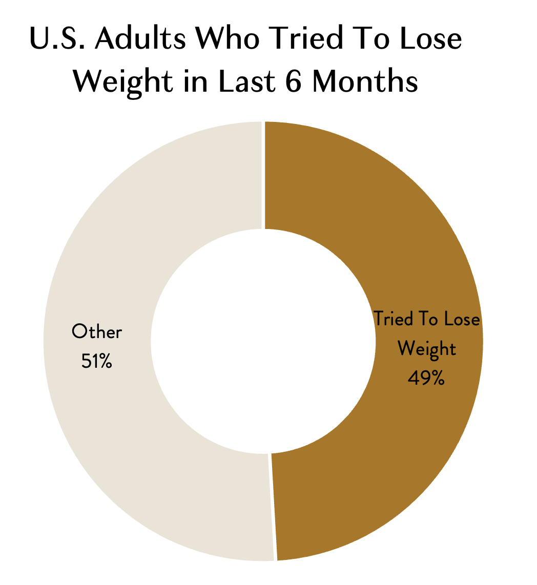
Obesity is a prevalent problem in our society, with the CDC reporting 42.4% of adults as obese and 9.2% of adults as severely obese in their 2017-2018 report. In turn, a study found that in the last 12 months 49.1% of U.S. adults had tried to lose weight.
People face many challenges when trying to lose weight. The top three barriers people face are situational barriers, stress/depression, and food cravings.
substituting some ingredients with weight loss friendly options (fat free, sugar free, low carb, zucchini noodles instead of pasta noodles, milk instead of cream, etc.)
including lots of fresh fruits/vegetables
using healthier cooking methods (light cooking spray mist instead of deep frying).
Thinlicious Chef focuses on the third barrier: food cravings. By providing video recipes for delicious meals, snacks, and desserts, users will feel satisfied with healthier alternatives. Recipes are modified from traditional recipes by:
These modifications will help users stay on track to lose weight without feeling deprived, addressing one of the top three barriers to weight loss.
Competitive Analysis
Three competitors were examined as part of this report. Allrecipes targets home cooks with mostly written recipes, and the occasional video. TikTok shares 30-65 second videos with users on any topic, including recipes. Nestle Toll House provides written recipes using their sweet products.
Allrecipes
Users: home cooks
Format: mostly written recipes, few video recipes
Nestle Toll House
Users: users of Nestle Toll House products (bakers)
Format: written recipes
TikTok (Food)
Users: casual home cooks, often beginners
Format: 30-65 second video recipes
The following gaps were observed in competitors’ websites, which gives Thinlicious Chef the opportunity to shine:
There is no obvious search area where all the search options are housed.
Lack a scheduling feature where the meal the user is looking at can be added to a list for this week’s meal plan.
Missing an obvious area where users can go to look for meal ideas, based on the meal they are wanting.
In need of a way to organize saved recipes beyond a basic list like “my favorites” when initially saving.
When recipes are saved initially, they go into one generic “my favorites” section. There are no subcategories currently available.
For example: lunch recipes cannot be categorized into “lunch-salads” and “lunch-wraps.”
Pain Points
-
Not having a lot of cooking experience makes it hard to know what substitutions are appropriate in recipes and how to perform new cooking techniques.
-
Searching for healthy recipes that are delicious but not labor intensive takes time and effort.
-
It is a lot easier to order from a food delivery service than taking the time to make a healthy recipe that is a gamble and may not taste good.
Observations From Interviews
Users felt that many ingredients in recipes could be replaced with healthier or lower calorie alternatives to help with weight loss.
Users felt that during a weight loss journey sweets and junk food should not be cut out completely, but rather moderated and/or replaced with healthier versions of that same food.
Compared to the traditional written recipe, most users found the video recipe more motivating.
All users agreed that including a video recipe at the top and a paper recipe below it would be the most helpful to them and lead to higher success rates.
What This Means For Our App
Recipes will be leaner versions of popular food and meals, with healthier or lower calorie alternatives.
Recipes will be provided for healthier versions of popular sweets and junk food.
A 30-60 second video recipe will be at the top of each recipe page, which will begin playing as soon as the page is loaded. It will include the ingredients with measurements.
A paper recipe will be provided below the video so users do not need to worry about writing down the ingredients or instructions while watching the video.
“I have a harder time creating balanced meals when I don’t feel like I know how to cook yummy veggies without dripping them in butter.”
Meet a User: Abby
Abby Diaz
Age: 30
Education: Associate’s Degree
Hometown: Houston, Texas
Family: Married
Occupation: Software Developer
My name is Abby and I am 30 year old software developer working remotely. I know how to cook basic meals, but do not know much about healthier/low calorie substitutions. While I like eating vegetables, I do not know how to cook them besides covering them in butter. Giving up sweets and snacks is not something I could do, so I need to find better alternatives for the food I crave.
User Journey Map
Abby’s user journey map shows a potential user’s steps, feelings, and opportunities for improvements.
Defining Goals
Goals From User Research
Provide leaner recipes of popular foods/meals.
Create healthier versions of sweets and junk food.
Include short video recipes (30-60 seconds) at the top of a recipe page.
Provide a written version of the recipe below video.
Goals From The Competitive Analysis
Create a homepage that includes all the search options in one area.
Create a “meals this week” section where the selected recipe will be added for future reference when cooking this week.
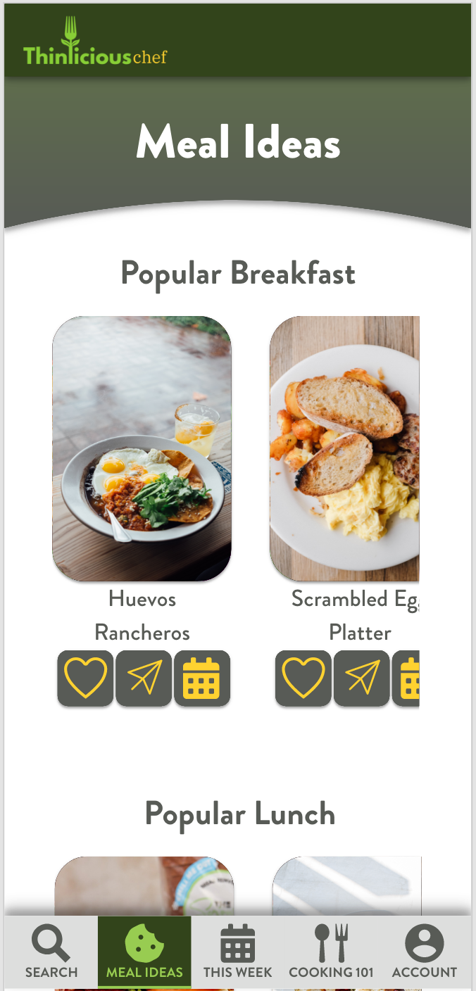
Create a section for meal ideas, sorted by type of meal (e.g. breakfast).
When saving a recipe, provide basic categories and a dropdown with subcategories for each one. Users will then save to a subcategory.
Preparing the Journey
The next step of our journey was to ideate. This was initially done through user flows and paper wireframes. Later the paper wireframes were turned into digital wireframes and eventually into prototypes.
Planning For Users
User Flow and Information Architecture
Paper Wireframes
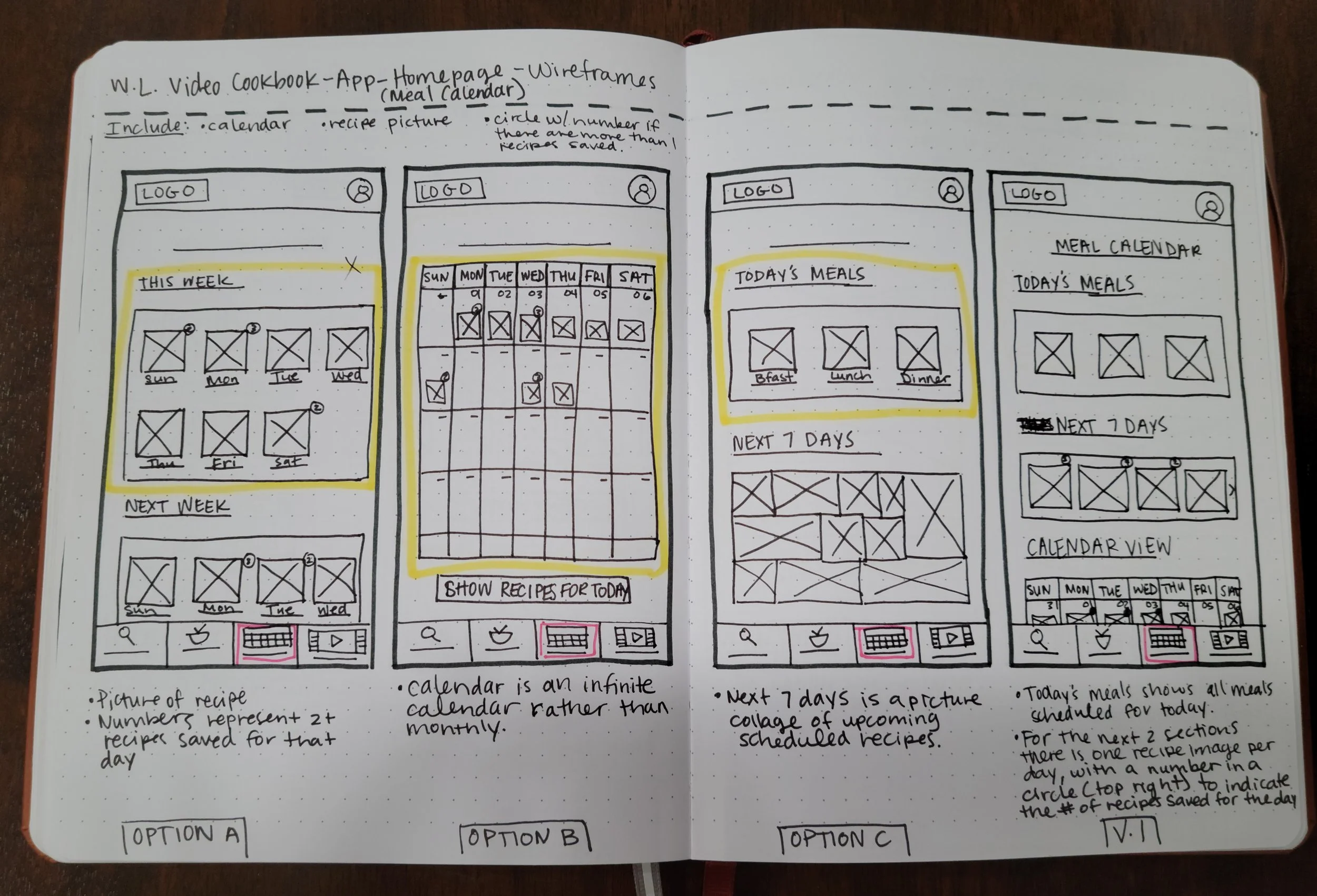
All app and website pages began as paper wireframes. Several options were created for each page, with Version 1 being a compilation of elements from Options A-C.
Besides combining elements from Options A-C, some Version 1 wireframes also incorporated new elements and design changes.
Digital Wireframes
➡
Adobe XD was then used to convert paper wireframes into digital wireframes.
Adapting For Users
Low Fidelity Prototype
Digital wireframes in Adobe XD were connected and animated to create a low fidelity prototype. The low fidelity prototype was then used to conduct a usability study.
First Usability Study
Five diverse users were part of the first usability study. The goal of the study was to figure out if users could easily find recipes that met their needs and wants. Key performance indicators were conversion rates and a system usability scale. Major findings from the study include:
Users did not have the tools necessary to look for and narrow down results based on their goals.
Users did not find the meal generator tab intuitive.
Users did not find the calendar portion of the meal planning useful.
High Fidelity Prototype
Key findings from the first usability study were taken into account when making mockups and the high fidelity prototype.
Insight # 1: Users did not have the tools necessary to look for and narrow down results based on their goals.
➡
Insight #2: Users did not find the meal generator tab intuitive.
➡
Insight #3: Users did not find the calendar portion of the meal planning useful.
➡
The high fidelity prototype was then used to conduct a second usability study.
Second Usability Study
Five different users were part of the second usability study. The goal of the study was to figure out if users could find a recipe they liked and save it. The key performance indicator monitored was drop off rates. Major findings from the study include:
Users found the buttons below the recipe images to be distracting when looking for a recipe.
Users found the target area for the checkboxes on the drop-downs to be too small.
Final Product
Key findings from the second usability study were taken into account when creating the final product.
Insight # 1: Users found the buttons below the recipe images to be distracting when looking for a recipe.
➡
Insight # 2: Users found the target area for the checkboxes on the drop-downs to be too small.
➡
Unveiling The Final Product
This last section will outline the style guide used in the final product of Thinlicious Chef. It will also give a preview of the app before it heads to developers.
Preparing For Development
Style Guide
LOGO: Our product connects users with healthier recipes. One way they are better is by encouraging the inclusion of more fruits and vegetables. The logo combines the eating and plant concept by using the “l” in “thinlicious” to create a fork with leaves. “Thinlicious chef” embodies the idea of cooking and eating delicious recipes while losing weight. It reminds users that eating to lose weight can be effective and enjoyable.
➡
COLOR: White and dark grey were used as the primary colors, which gives the app an overall clean feel. Two dark green colors made up the secondary colors, while the accent colors were lime green and bright yellow. Green was chosen because of its connection to plants (fruits/vegetables), health (healthy weight), and growth (personal growth). Yellow was used because it is associated with happiness (improved health) and optimism.
➡
TYPOGRAPHY: Brandon Grotesque in black, bold, medium, regular and light was used for all the type. It was selected because it is easy to read, warm, and inviting.
➡
TYPE SCALE: Brandon Grotesque in black, bold, medium, regular and light was used for all the type. A type scale was created for both the desktop and mobile versions. This creates consistency and appropriate sizing for fonts as users use the mobile app and responsive website from devices of varying screen sizes.
➡
Seeing The Finished Product
Final Look
What I Learned
Thinlicious Chef was my third project as part of the Google UX Design Professional Certificate so I started the project with a lot more experience and knowledge of the process and tools than my previous projects. This foresight helped me more efficient. One of the places where this experience helped me the most was in the digital designing phase on Adobe XD. Having completed other projects on Adobe XD, I knew that the way I designed an element on the program made a huge difference down the road. For example, I began designing elements as components from the very first draft. This simple change was a game changer in the amount of time I spent on the project later. Future changes could be made by simply modifying the master component and all the instances of that component would immediately change. Those alterations could be anything dealing with design, color, typography, states, movement, etc. As I continue to gain UX design experience, I know I will learn even more ways to improve and grow.
If you have any questions or want to talk about this project, feel free to reach out to me!


